Dear Sherwin Williams
Dear Sherwin Williams,
Sales have been good for you recently. Margins have been contracting, but over-all revenues are up for the fifth straight quarter. Founded in 1866, you've managed to make the Forbes Global 2000 list with a market cap of $8.9 Billion, and more than 30,000 employees. Sherwin William's rise over the last thirty years looks like this.
Henry Sherwin patented the first resealable paint can in 1877. What a day that must have been. In 1903, Sherwin Williams opened a sales office in London. I can only imagine the excitement in Henry's eyes as he sailed across the Atlantic and crossed the newly constructed threshold of his first overseas office. That must have felt like a real affirmation of his life- a milestone accomplishment, the crowning achievement of a rags-to-riches success story. In 1905 Sherwin Williams came up with a new logo- a logo most consumers would recognize.
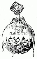 Now I'm sure you guys thought that this was a great logo at the time. Oil derricks were creating big outdoor dew ponds filled with black gold, mining companies let their tailings be carried away happily on the currents of local streams. I'm sure lead-based paint was one of the gentler juices covering the earth at the time. Ideologically, it was still a man vs. nature period in our history. The vast majority of people used horses to traverse daunting distances, farmers and homesteaders struggled to scratch a living out of the fresh, wild, North American continent, and the Spanish Influenza epidemic was about to remind people that we were still vying for survival on this planet with the smallest living organisms among us. Man was intent on dominating nature, Sherwin Williams Co. was intent on dominating the paint market, and this logo illustrated those goals perfectly well.
I have a few gripes with the original drawing- naming "Europe" and "Africa" seems kind of redundant. If people can't distinguish Europe and Africa just by looking at them, maybe the solution is to redraw Europe and Africa as recognizable shapes, instead of taking the lazy man's way out and slapping labels on the sloppy mess you intended to be a globe. The logo's still a little busy- perhaps more complicated and intricate than a brand indicator should be, but hey; it was a different time. Apparently a dumber time, when people couldn't recognize the European or African continents. But also a slower time. A time when people drove around the country at five miles per hour, waited weeks to receive a text message, and maybe even would be willing to stand in front of a Sherwin Williams sign for five minutes and study the logo.
 It's hard to put away a good logo. The Cover the Earth ride has lasted over one hundred years now, and I'm sure every passing year makes it more cherished over at Sherwin Williams headquarters in Cleveland, Ohio.
But I mean- guys. Please. Take a second look at this thing. Let's even set aside the whole environmental faux pas; the thing is just plain sinister. What are we doing here- drowning people in paint? People can't breathe under a thick red film of liquid paint. I know there's no up or down in space, but it sure looks like the earth is all tilted over so that the bucket can unload its contents directly on Cleveland. I'm assuming the massive tonnage of all that paint is what has thrown off the axis. The earth is askew- the four seasons as we know them cannot exist on Planet Paint. Instead of the moon, we have this SWP paint can orbiting the earth. I'm imagining a dull, season-less world in which everything is covered in blood-red. A literal hell. It calls to mind that bible verse in Revelation about a river of blood flowing up to the height of a horse's bridle.
And the physics of this thing are just insulting. I'm being expected to suspend my disbelief long enough to go along with paint dripping "down" into the vacuum of space AWAY from the earth, the nearest object of greatest mass. And a paint can of that size and mass should crumple under its own weight into a semi spheroid. The volume of the paint still inside the can added to the volume of paint already poured out onto the earth clearly adds up to a volume larger than that which the can could have ever contained originally.
Oh, but it's not meant to be taken literally, I'm sure you're thinking. Well OK, I'll go along with that for a second. But then what is this supposed to be a metaphor for? Monopolistic intentions? A zombie army of mindless consumers? The military-industrial complex used as a tool for imperialism to open up overseas markets? A bloody paint-apocalypse yet to come?
 I'm sorry to say it, gentleman, but it's time for this grand ol' logo to go-go. The environmental incongruence is almost too easy, so I'll suffice it to demonstrate that when I was trying to look up images for this letter, I stumbled upon a lot of other people who had similar confusion about the Cover the Earth logo, and that confusion could generally be paraphrased as "What the fuck?"
"Tell me your paints bring the beauty of the outside indoors. Give me pretty nature-inspired names like sea shell and amethyst. I can understand these kinds of appeals to my emotions.. Don't outright say you want to 'cover the earth' with your toxic crap." - Colette Cope
"Oh my. This is a public relations nightmare. Who was the marketing genius that had this terrible idea? What are they trying to imply exactly?" - Caroline Brown
"And as many of you pointed out, the combination of the four key elements (initials, paint can, pour/drip and globe) strongly telegraphs negative connotations of heaviness, messiness, and pollution all wrapped in a hopeless and antiquated design. And the "Cover the Earth" tagline doesn’t help matters one bit either." - Rick Barrack
"The goal to cover the earth with paint sounds like a plot by one of Batman's nemesis from the campy kitschy television program. Maybe a villain with a name like PaintLord , Demi-Gloss, or PaintRoller Meister!" - Travis Rykbos
"...it seems a bit unreasonable to want to cover the entire earth surface in paint." - Bill Gillam
"Immediately, I was convinced that it was the logo for an organization devoted to evil, world domination, and global genocide." - Little Max
"Last week I was driving down the street and suddenly a sign (not from God), jumped out and smacked me in the face." - Brand Syndicate
"it looks like the Earth is being drenched in fresh blood. Nice touch." - The Straight Dope
"apparently no one at SWP has connected the dots. Covering our precious earth with paint seems an odd and inappropriate metaphor." - FreshView Marketing
"'We're proud to announce that the entire Northern Hemisphere should be slathered 10 feet deep in candy-apple red Latex Semi-Gloss by year's end,' Sherwin-Williams CEO Christopher Connor said. 'And we are fully confident that the rest of the globe can be completed well before the giant space bucket runs out of paint.'" - The Onion
Sincerely,
Sebastian Braff
Sales have been good for you recently. Margins have been contracting, but over-all revenues are up for the fifth straight quarter. Founded in 1866, you've managed to make the Forbes Global 2000 list with a market cap of $8.9 Billion, and more than 30,000 employees. Sherwin William's rise over the last thirty years looks like this.
Henry Sherwin patented the first resealable paint can in 1877. What a day that must have been. In 1903, Sherwin Williams opened a sales office in London. I can only imagine the excitement in Henry's eyes as he sailed across the Atlantic and crossed the newly constructed threshold of his first overseas office. That must have felt like a real affirmation of his life- a milestone accomplishment, the crowning achievement of a rags-to-riches success story. In 1905 Sherwin Williams came up with a new logo- a logo most consumers would recognize.

I have a few gripes with the original drawing- naming "Europe" and "Africa" seems kind of redundant. If people can't distinguish Europe and Africa just by looking at them, maybe the solution is to redraw Europe and Africa as recognizable shapes, instead of taking the lazy man's way out and slapping labels on the sloppy mess you intended to be a globe. The logo's still a little busy- perhaps more complicated and intricate than a brand indicator should be, but hey; it was a different time. Apparently a dumber time, when people couldn't recognize the European or African continents. But also a slower time. A time when people drove around the country at five miles per hour, waited weeks to receive a text message, and maybe even would be willing to stand in front of a Sherwin Williams sign for five minutes and study the logo.

But I mean- guys. Please. Take a second look at this thing. Let's even set aside the whole environmental faux pas; the thing is just plain sinister. What are we doing here- drowning people in paint? People can't breathe under a thick red film of liquid paint. I know there's no up or down in space, but it sure looks like the earth is all tilted over so that the bucket can unload its contents directly on Cleveland. I'm assuming the massive tonnage of all that paint is what has thrown off the axis. The earth is askew- the four seasons as we know them cannot exist on Planet Paint. Instead of the moon, we have this SWP paint can orbiting the earth. I'm imagining a dull, season-less world in which everything is covered in blood-red. A literal hell. It calls to mind that bible verse in Revelation about a river of blood flowing up to the height of a horse's bridle.
And the physics of this thing are just insulting. I'm being expected to suspend my disbelief long enough to go along with paint dripping "down" into the vacuum of space AWAY from the earth, the nearest object of greatest mass. And a paint can of that size and mass should crumple under its own weight into a semi spheroid. The volume of the paint still inside the can added to the volume of paint already poured out onto the earth clearly adds up to a volume larger than that which the can could have ever contained originally.
Oh, but it's not meant to be taken literally, I'm sure you're thinking. Well OK, I'll go along with that for a second. But then what is this supposed to be a metaphor for? Monopolistic intentions? A zombie army of mindless consumers? The military-industrial complex used as a tool for imperialism to open up overseas markets? A bloody paint-apocalypse yet to come?

"Tell me your paints bring the beauty of the outside indoors. Give me pretty nature-inspired names like sea shell and amethyst. I can understand these kinds of appeals to my emotions.. Don't outright say you want to 'cover the earth' with your toxic crap." - Colette Cope
"WTF? 'Cover the Earth': The Least Environmentally Friendly Logo…ever" - Jeff Bonforte
"And as many of you pointed out, the combination of the four key elements (initials, paint can, pour/drip and globe) strongly telegraphs negative connotations of heaviness, messiness, and pollution all wrapped in a hopeless and antiquated design. And the "Cover the Earth" tagline doesn’t help matters one bit either." - Rick Barrack
"The goal to cover the earth with paint sounds like a plot by one of Batman's nemesis from the campy kitschy television program. Maybe a villain with a name like PaintLord , Demi-Gloss, or PaintRoller Meister!" - Travis Rykbos
"...it seems a bit unreasonable to want to cover the entire earth surface in paint." - Bill Gillam
"Immediately, I was convinced that it was the logo for an organization devoted to evil, world domination, and global genocide." - Little Max
"Last week I was driving down the street and suddenly a sign (not from God), jumped out and smacked me in the face." - Brand Syndicate
"it looks like the Earth is being drenched in fresh blood. Nice touch." - The Straight Dope
"apparently no one at SWP has connected the dots. Covering our precious earth with paint seems an odd and inappropriate metaphor." - FreshView Marketing
"'We're proud to announce that the entire Northern Hemisphere should be slathered 10 feet deep in candy-apple red Latex Semi-Gloss by year's end,' Sherwin-Williams CEO Christopher Connor said. 'And we are fully confident that the rest of the globe can be completed well before the giant space bucket runs out of paint.'" - The Onion
Sincerely,
Sebastian Braff
Comments
Post a Comment